

Unveiling the Secrets of Candlestick Chart Patterns in Trading
The world of trading can seem intimidating, with its jargon and complex strategies. However, with an understanding of some basic principles and tools, one can navigate this terrain. One such tool is the Candlestick Chart Patterns in trading. Originating from 17th-century Japan, the Candlestick Chart is now a universally adopted technique in trading. It gets its name from the graphical depiction of price movements, which resemble candlesticks.
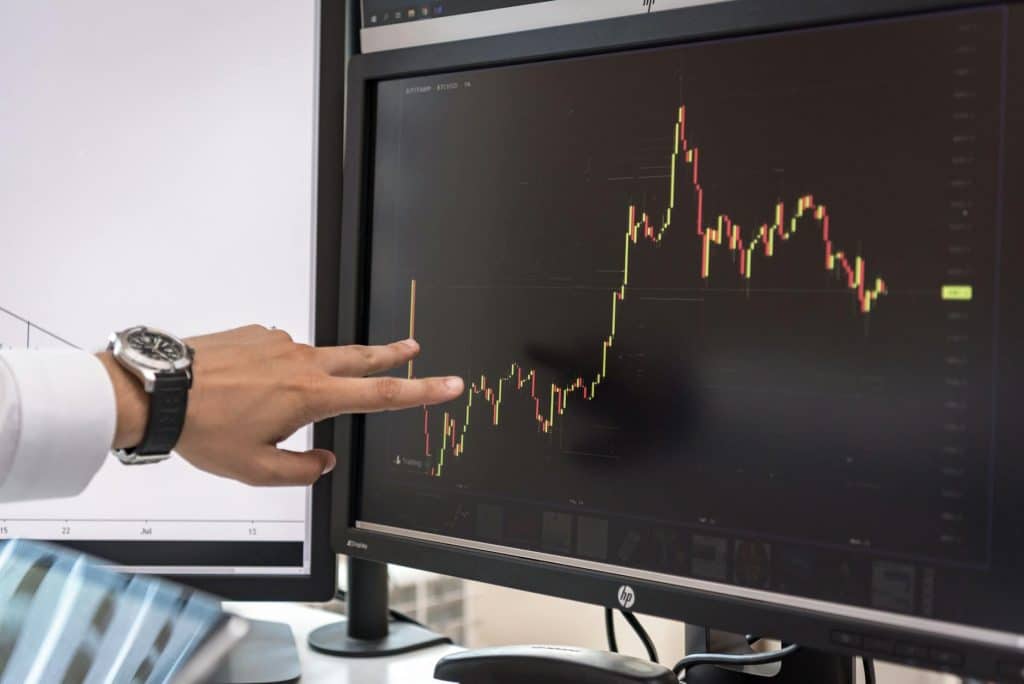
Understanding Candlesticks
In trading, Candlesticks are graphical representations of price movements in a specified time period. Each candlestick consists of four main components: the open, high, low, and close. The “body” of the candlestick is the area between the open and close of the time period, while the “wicks” or “shadows” represent the high and low.
- If the close is higher than the open (indicating a price increase), the body of the candlestick is hollow or filled with a light color. This is referred to as a “bullish candle”.
- If the close is lower than the open (indicating a price decrease), the body of the candlestick is filled with a dark color. This is referred to as a “bearish candle”.
The length of the body and the wicks can provide traders with information about the trading session. Long bodies suggest strong buying or selling pressure, while short bodies suggest little buying or selling activity. Similarly, long wicks can indicate a reversal of price direction, while short wicks may point to minimal price movement.
Candlestick Chart Patterns
Candlestick patterns are specific formations of one or more candlesticks, which can give traders insights into market psychology and potential price movements. Here are a few classic patterns:
- Doji: A Doji occurs when the opening and closing prices are virtually the same. The pattern typically represents indecision in the market.
- Hammer: A Hammer is a bullish reversal pattern that forms during a downtrend. It is named for the hammer-like appearance of a small body with a long lower wick.
- Hanging Man: This is a bearish reversal pattern that also resembles a hanging man with a dangling rope. It indicates that selling pressure is starting to increase.
- Bullish Engulfing: This pattern occurs when a small bearish candle is followed by a large bullish candle that ‘engulfs’ the first candle. This suggests a potential reversal from a downtrend to an uptrend.
- Bearish Engulfing: The opposite of bullish engulfing, this pattern is a signal of potential reversal from an uptrend to a downtrend.
Candlestick chart patterns in trading provide a visual way to interpret price data, allowing traders to identify market trends and sentiment. However, it’s important to remember that while candlestick patterns can be helpful in predicting potential market movements, they should ideally be used in conjunction with other forms of analysis for the best results.
Understanding the language of candlestick charts is a powerful tool for traders. It helps decipher the story of price action, providing clues about market sentiment and potential reversals. However, like all trading tools, candlestick patterns are not foolproof and should be used in conjunction with other technical analysis tools to increase the probabilities of successful trading outcomes.